How Burnt Orange Came to Be

On any given Saturday, you might find yourself inside Darrell K Royal-Texas Memorial Stadium, or under the shady oaks of the Etter-Harbin Alumni Center, awash in a sea of orange. Stick around longer, though, and you’re likely to encounter a familiar refrain. You may hear someone complain that a passerby’s shirt or ball cap isn’t quite the right hue. Maybe a fair-weather fan or a new student had only one orange shirt, and it isn’t Pantone 159—Texas’ official shade.
In 1966, a group of 72 students and alumni made a similar complaint. In a show of angry letter-writing, the likes of which would amaze even Grandpa Simpson, the group submitted a formal petition to the UT System Board of Regents. Their cause: Eliminate the “dark, muddy, and murky burnt orange” that coach Darrell K Royal, Life Member, had the Longhorns wearing, and replace it with the “correct light to medium orange” the school had previously embraced. Over the years, Texas teams had worn a surprising variety of colors, sometimes a bright orange—the earliest hue used by the Longhorns—sometimes the more familiar dark orange. The signers considered themselves traditionalists, hearkening back to the regents’ 1950 adoption of an official color rendering of the 1905 university seal, one designed by an engineering professor—and with a notably lighter shade of orange. “The winds of whim and aesthetic taste must not be permitted to overturn The University’s tradition,” the petition declared.
Their passion is indicative of a long and surprisingly rich history of our particular shade of orange, a history of football coaches, baseball games, and world wars. The burnt orange displayed on gameday is a symbol not just of what UT is today, of team spirit, but of a history of infighting, regime change, and legal skirmishes. It has been shaped by regents, students and alumni, and braggadocious ballplayers. For a time, the winds of whim did change our shade. Could it change again?
Burning With Pride
It’s strange to think, in a world saturated by Longhorn merchandise, that anyone (much less someone from as recently as 1966) could think of burnt orange as anything but traditional. It is the color that all die-hard Longhorns proverbially bleed. It is a source of pride and a carefully guarded piece of intellectual property. It’s the handkerchief tied around the neck of a Texas Cowboy and the namesake garment slung over the shoulders of every Orange Jacket. Students stuff their dorm room drawers with dozens of free burnt-orange T-shirts within a week of walking onto campus. Infants wiggle around in burnt-orange onesies (officially licensed, of course), burnt-orange trucks drive across the state, and burnt-orange license plates line I-35. And, of course, people fiddle with burnt-orange fidget spinners.
There is a concept in psychology known as consistency bias, defined as incorrectly believing that one’s current attitudes were the same in the past. When it comes to burnt orange, it’s an easy mistake to make. Burnt orange is synonymous with UT. Even describing the “burnt-orange faithful” has more to do with the collective mindset of Texas fans than the ubiquitous Pantone they wear on gameday. But it hasn’t always been that way.
Like a light wave bouncing into the eye, the history of UT’s color isn’t a straight line to today’s burnt orange. It’s an oscillating—and at almost every turn contentious—wave of varying shades, from whatever was available at a dusty general store to a precise, legally-protected color. With it comes all the emotions of fandom, of personal and group identity, even individual biology. And the story is as old as the university itself.

The Curveball
You can thank Gussie Brown. Miss Brown, of Orange, Texas, was the first to come up with the the idea that Texas should have team colors.
As Venable Proctor wrote in a 1913 Alcalde article, it was a dour April day in 1885, when Brown stood on the platform at Third and Congress, as the train, waiting to depart for Georgetown, poured smoke into an already overcast sky. Along with her friends, Clarence Miller and Proctor, Brown was huddled with a group of students from the then-two-year-old University of Texas, as well as their chaperone, Mrs. Helen Marr Kirby, preparing to take the 30-mile journey to Georgetown to witness UT’s first baseball game.
Legend has it that a UT student claimed he was the only man in Texas capable of throwing a curveball, a recent invention that some claimed was a dirty trick. Fellow students formed a team around him, and put out a call to have a game to test their pitcher. A group from Southwestern University answered, and invited the Texas team up for the afternoon.
The train bell was ringing when Brown realized that the UT backers had no way of identifying themselves. She alerted her fellow students—they had to find something. Miller and Proctor raced a half block up the street to a general store, intent on buying ribbon before the train departed. Before the advent of be-swooshed T-shirts and limited-edition shoes, team apparel was little more than a curl of ribbon pinned to a lapel. The two students burst into the store and breathlessly explained that they needed two colors of ribbon. The storekeep asked what colors they’d prefer, and the men responded that they’d take whatever they had. He had plenty of orange and white, a fact Proctor later called “particularly fortunate.” He and Miller, bolts of ribbon in hand, made it onto the caboose.
The ribbons were on display in Georgetown that day, but the curveball was not, and Texas lost. But UT had a team, and that team had colors. Sort of. Between 1885 and 1900, orange and white was common, but by no means universal.
For a brief time, students donned gold and white, inspired by the yellow pressed-brick-and-limestone buildings being constructed around campus (the Dorothy L. Gebauer building is a rare example still standing). Orange was still popular, however, and the athletics council re-adopted the “more masculine” orange and white after a year. But in 1898, tired of trying to wrest tough stains from white uniforms, the council swapped it for maroon (the Aggies were still wearing red back then). It was a popular choice with students, and stores began carrying orange and maroon caps, but the old timers were still flying orange and white.
In 1899, Texas trotted out its football team in various combinations of gold, white, orange, and maroon. The following year, the Board of Regents stepped in to determine an official set of colors, once and presumably for all. Students, faculty, and alumni cast 1,111 votes. Orange and white won out with 562 votes, a seven-vote majority. Orange and maroon received 310, royal blue 203, crimson 10, royal blue and crimson 11, with a handful of single-vote-getters.
And so it was. For a while.

Tone and Taste
We don’t know precisely why orange and white won out in the 1900 poll, or why it stayed so popular in the tenuous early days of UT athletics. But we know a bit about how color works, and what it means to people. It’s a matter of both personal taste and group identity, in addition to science.
“Color is really a vibration. It’s energy,” says Gillian Rose, a New York-based color scientist and consultant. “It is not cognitive, it’s a physical, biological reaction.” Our hypothalamus, at the lower middle portion of our brains, processes color along with other sensory inputs, and translates those senses into emotions and even physical states, like thirst or hunger.
Humans, therefore, have innate reactions to certain colors, ancestral memories that tell us that, for example, black and yellow—the easiest color contrast to see—means danger. Rose claims that extroverted people like vibrant colors, searching for external stimulation, while introverted people seek calm, cool colors. But socially, we’re programmed with additional associations. Think color-coded gender-reveals for expecting parents, or red-and-blue maps in the news. These meanings are constructed, but powerful.
Burnt orange is, Longhorns will be pleased to know, a special color.
“When we look at orange, we’re looking at how much yellow versus red is in there,” she says. Ours is a patinated orange—browner, darker, and calmer. Rose, looking at a swatch of Texas orange, reads it like a tarot card.
Aggression. Enthusiasm. Rejuvenation. It’s a competitive color. “Courage is a big one. Over-confident,” she laughs. “That’s good for a team, right?”
In those early years of UT’s life, however, Texas fans waved banners and wore ribbons in a more vibrant, energetic, bright shade of orange. A youthful shade. Perhaps it fit a young and aggressive university. Eventually, though, the color aged and gained its patina, along with the university itself.
Yellow Bellies
On Sept. 19, 1925, a brief item ran in The Daily Texan under the headline “New Orange Color for Longhorns.” UT teams had been wearing orange and white for a quarter century, but because other schools were beginning to claim the same color scheme (Tennessee adopted its own orange and white in 1889, though the team didn’t wear orange jerseys until 1922), the athletics department made a change to help the Longhorns stand out among the herd—“an orange and white which should be Texas’ own.”
“As a consequence,” the paper stated, “a combination of dyes was used to produce a shade different from the standard orange. The new shade is darker, being more of a burnt orange.”
The color change, according to research by UT historian Jim Nicar, is credited to Coach E. J. “Doc” Stewart, whom athletic director Theo Bellmont poached from Clemson in 1923, and who was alleged to be such a gifted orator that he was offered a job in the English department. He was fired in 1926, despite a solid performance, and Stewart may have been inspired by the fact that the teams’ traditional orange dye had an unfortunate tendency to bleed and wear over time, changing from orange to a pale yellow, and earning the team the unflattering nickname of “yellow bellies.”
When Clyde Littlefield took charge in 1927, he worked with O’Shea Knitting Mills of Chicago to perfect the dyes needed to ensure that Horns stayed suitably dark orange. Littlefield recalled that O’Shea told him: “When you get the color of orange you like, we’re gonna establish it as your orange.”
Longtime Texas sports information director Bill Little, BJ ’65, Life Member, points out that, “the color that Mr. Littlefield helped create back in 1928 is officially named Texas Orange.” O’Shea made good on his promise.
But during World War II, when everything from chocolate to typewriters was rationed, Texas Orange dyes went off the market—they had been produced for O’Shea in Germany. The Horns switched back to a lighter dye, another yellowy orange that the regents made official on UT’s seal in 1950.
It stayed that way for less than a decade, when a young coach and former Oklahoma quarterback named Darrell K Royal showed up on the Forty Acres.

Royal Orange
Back in 1966, the regents were carefully considering the outrage around the new old shade of burnt orange. They responded to the petition in favor of a lighter orange in true regental style, convening a faculty committee to create a report on the matter. The committee, it seems, took this responsibility quite seriously, and presented to the regents a report with recommendations.
The report included this rather somber, Atlas-like note of grave responsibility: “The committee’s approach to the issue was one of serious intent, recognizing the forces of traditional continuities and symbolism which are associated with patriotic emotion and which are invaluable in giving both identity and unifying spirit to a university,” wrote committee chairman and UT Vice Chancellor for Public Affairs Raymond Vowell.
After sampling swatches and piecing together a (somewhat incorrect) timeline, the committee came down firmly in favor of burnt orange.
“It is without question that tradition and common usage have shown a decided general preference for the darker hue or burnt orange,” Vowell continued. “The burnt orange is nationally identified as the official color of The University of Texas and is described elsewhere as ‘Texas Orange.’” The regents here made an interesting choice that foreshadows the contemporary legal protection of the color. It’s an important distinction, as burnt orange is a general term, but using the shade along with, say, the word “Texas” might today be seen by UT as an infringement on the school’s identity.
It was 1967 when burnt orange became official. It had seen fits and starts, and was now shaking up the status quo, sending the traditionalists up in arms. It was well on its way to becoming a tradition in its own right.
The Dye Is Cast
It’s hard to imagine burnt orange ever giving way. At this point it is enshrined by the regents as the official shade. It is legally protected, so don’t go attempting to use Pantone 159 for your business. It has, in the last 50 years, become a classic. And isn’t there something, for lack of a better word, Texas-y about burnt orange? It is the color of red dirt, the color of a steer’s hide.
“The burnt-orange color is truly unique and distinctive, and is one of the biggest differentiators for our brand when compared to other institutions in this country and across the world,” according to UT’s Brand, Trademarks and Licensing office. Not only is the shade legally protected, but it’s carefully crafted to ensure that in person and on TV, the Longhorns look like they’re wearing the correct hue, using “the latest technology to pinpoint the shade of burnt orange that most resembles the original intention for the color and that our fans expect.”
The legal protections aren’t just in place to ensure that burnt orange is used properly in official capacities, but also that it isn’t used in any unofficial ways. Back in 2009, an Austin-based agency called Mutual Mobile created UT Directory, a mobile-friendly version of UT’s staff and student directory. The university objected to the company’s use of burnt orange, however, maintaining that the use of the color, and the use of UT in the name, could lead people to believe it was an official UT product. The company did away with the color scheme.
With all that work, and tradition, baked into the color, it’s now an integral part of UT’s identity. And it seems unlikely to change as capriciously as it did in the past.
“If you stick with the same design for decades, as the Longhorns have done, then you basically become de facto classic. Simple design, great design. It ain’t broke, and they haven’t fixed it,” says Paul Lukas, a blogger for ESPN and founder of UniWatch, a website dedicated to analyzing sports uniforms. “Hope it stays that way.”
The public seems to agree. Texas Longhorns merchandise has consistently raked in the most royalties in college football, owning the top spot for eight consecutive years from 2006–2013, according to the Collegiate Licensing Company, a span that included the latter half of Mack Brown’s reign. The Horns’ uniforms are consistently ranked among the best in college football, and just last year, USA Today dubbed burnt orange and white the second-best color combination in college sports, trailing only Michigan’s blue and maize.
The deep association with the color may have something to do with the fact that Royal’s squads are the most celebrated in Longhorn history, up there with Mack Brown’s, who it should be noted, waged his own campaign to get Texas fans, long stereotyped as lackluster, to “Come early, be loud, stay late, and,” the slogan crucially added, “wear orange.” All of Texas’ football national title game appearances were in the burnt-orange era.
Texas’ use of lighter orange was also mostly confined to the era of black-and-white photography, which makes it harder for those early shades to stick, or even appear, in memory. And while many can still remember Royal’s reign, few, if any, can recall the days of Doc Stewart. At a time when teams embrace what Lukas calls “black for black’s sake” (BFBS for short), and teams seem to wear as many uniform combinations as there are games, Royal’s burnt orange signifies a less flashy, more earthy aesthetic, one that resonates today with generations of Texas fans. Not only has burnt orange been a tradition, off and on, for nearly a century, but the color itself seems rooted in history. A dignified shade of orange.

Keeping it Uniform
“I’m facing the prospect of having to spend 10 days in Oklahoma,” Scott Wilson says. “I’m breaking out in hives.”
Wilson, BBA ’72, Life Member, is in between watching the Horns’ Big 12 baseball tournament appearance in Norman and the NCAA golf championship in Stillwater. It’s not an entirely unusual sojourn for Wilson, who estimates he’s been to 6,000 UT sporting events in the past 60 years—“a bunch,” as he calls it. Over that time, he’s collected a houseful of Texas merchandise and ephemera, including two burnt-orange Cadillacs (the older being a parts vehicle), alongside old stadium seats, thousands of ball caps, banners, flags, and programs, most of it burnt orange. But not all of it.
“I went to my first football game in 1958. My dad bought me a pennant at that game, and it was the old orange, the bright orange,” he recalls. He still displays the little triangular flag at home.
“For years, not many people wore that much orange until Mack Brown came around and told them to wear orange,” he notes. “I confess, I was one of those people that wore anything—now I wear burnt orange every day.” He doubts it will ever change.
“God help us if somebody comes along and tries to change the football uniforms,” he says. “Even Notre Dame did it for a couple of games in some goofy uniform. Nobody would ever survive that in Austin.”
When Athletics Director Chris Del Conte was asked this year whether Texas’ football uniforms might change under his watch, he said he didn’t want to “mess with tradition.” When AM 1300 The Zone’s “The Bottom Line” asked head football coach Tom Herman, MEd ’00, whether the Horns might sport alternate uniforms, a popular trend in all sports, he pointed to tradition-bound programs as examples against change: “The last I checked, Alabama doesn’t have alternate uniforms. Penn State doesn’t have alternate uniforms,” he said. “It’s something that we need to think about, but I don’t know if it’s something I’m willing to commit to.”
Recently, some fans have noticed that certain officially licensed Longhorns gear seems a bit lighter in color than the traditional burnt orange—not quite the pre-Royal shade, but with perhaps a smidge less brown than in years past. The SB Nation website dedicated to all things Texas sports, Burnt Orange Nation, posed the question last November when the men’s basketball team revealed new jerseys for the PK80 Tournament: “Um, what’s up with the off-brand shade of burnt orange here?”
For what it’s worth, while Pantone 159 is always referred to as burnt orange by the university’s official brand guidelines, the color worn by Longhorns on the field and court and donned by millions of Longhorn faithful worldwide is still also sometimes referred to as “Texas Orange,” the phrase Vowell used in the faculty committee’s written statement to the Board of Regents. Senior Associate Athletics Director for Trademark Licensing Craig Westemeier says that burnt orange and “Texas Orange” are one in the same. In fact, in a request for a statement on the semantic discrepancy, Westemeier referred not to one or the other in describing the color synonymous with Longhorn fandom, but rather, to “burnt Texas orange.” After all, regardless of what you call the color, it means the same thing across the globe: an undying love for The University of Texas.
Maybe there’s another aspect to our die-hard feelings toward the somewhat staid shade. Maybe it represents something with which we want to associate. In addition to the burnt-orange color, the uniform designs have seen very few tweaks in the intervening decades as well, especially compared to other universities. The combination of a strong and wisened color on a no-nonsense uniform seems shorthand for UT, the athletic equivalent of the Tower lit orange.
It was the ’60s when Royal reintroduced burnt orange, a time of day-glo everything, psychedelic art, and new color TVs. Burnt orange would become a popular interior design and fashion color in the 1970s, a response to the extroverted colors of the previous decade. Royal’s reaction wasn’t a pendulum swing, though, but a choice.
Once Royal had the Horns in burnt orange, he was asked if he’d ever change the uniforms again—to add ornamentation, to liven up the design. But lively was not his aim.
“Hell, no,” Royal famously responded. “I’m not going to candy this thing up. These are work clothes.” And since Royal’s time, the clothes have worked. It’s hard to mess with tradition. Like coach said, you have to dance with the one that brung ya.
Share this article
-

Starting Here: Meet the 2024 President’s Leadership Award Winners
-

World-Changers Reconnect With the University Through the Tower Fellows Program
-

Taking Over From Legendary Swim Coach Eddie Reese Is Another Legend
-

Racing Ahead: The 2024 President’s Impact Award
-
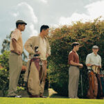
The Long Game Brings Local Heroes From the Putting Green to the Silver Screen
-

Beloved Director Celebrates 30 Years Leading the Scottish Rite Dormitory
-
Starting Here: Meet the 2024 President’s Leadership Award Winners
-
World-Changers Reconnect With the University Through the Tower Fellows Program
-
Taking Over From Legendary Swim Coach Eddie Reese Is Another Legend
-
Racing Ahead: The 2024 President’s Impact Award


No comments
Be the first one to leave a comment.